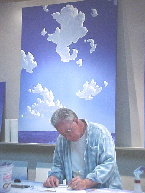
Phil Epp in his studio
(photo provided by Phil Epp)
 December 2003
vol. 58 no. 4
Back to Table of Contents
December 2003
vol. 58 no. 4
Back to Table of Contents
Born in Henderson, Nebraska, on August 28, 1946, Phil Epp became an artist, graduated from Bethel College in 1972, and taught art in the Newton public school system for 30 years, retiring in May 2003. In the evolution of his art practice, his paintings have become widely known; his work is now available in galleries in Santa Fe and Taos, New Mexico; Chicago, Illinois; Kansas City, Missouri; and Tubac, Arizona; and in municipal settings with several recent large-scale, sculptural, collaborative public art projects. This interview was conducted August 27, 2003, at Epp's studio east of Newton, Kansas, a structure added three years ago to the home he shares with his wife, art teacher Karen Epp, two children Kate and Justin (when they were younger), three horses, and a dog. The home and studio are set on 16 acres, and Phil and Karen designed it in relation to the Spanish-influenced architecture of the American Southwest.
Phil Epp in his studio
(photo provided by Phil Epp)
John Thiesen: In what ways was Henderson, Nebraska a place that was conducive to producing art and artists and in what ways was it not supportive of art and artists?
Phil Epp: That's a really big, broad question. As far as art is concerned, my parents were encouraging of my drawing. They also had an aesthetic sense about the land that I think was important. The wide-openness of the landscape and my parents' interest in the aesthetics of the weather was really significant
JT: So in some ways, you would say the geography, as much as, or more than, the human community, was a factor.
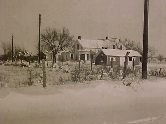
Epp home in Henderson, Nebraska, late 1950s
(photo provided by Phil Epp)
PE: There were individuals in the community who were very supportive. Basically we're talking Mennonites here, so we're talking music, and I didn't fit that.
JT: Was there an art program at the high school level?
PE: Not at the high school level. I remember an elementary school teacher, Evelyn Regier. The aesthetic interest was always there, whether I was working with horses, or school or whatever. As far as doing art I don't think that was really nurtured until I met Bob Regier [professor of art at Bethel College]. He was very influential. But not the first person I had met who did art; I also had a cousin who did art, Judy Mierau, and she was a big inspiration too. But the community as a whole focused on music. The community as a society may have thought that visual art was a frivolous kind of talent to have.
JT: Did you go directly from high school to Bethel?
PE: I did.
JT: What years were you at Bethel?
PE: 1965 — I went for 2-3 years. That was the time of the draft, so I went into the alternative service and was married then, and did service for a couple of years, and then I came back. I ended up graduating in 1972.
JT: Who was teaching art then?
PE: Bob Regier, Paul Friesen, and Mike Almanza.
Ami Regier: So what happened next? How did you find your way into a life of art?
PE: Well, then I went looking for a job as a teacher and stayed with that for 30 some years. Yes, I was always an art teacher. Then, a lot of times the question came up, should I get my master's? I always kind of balked. First of all, I didn't want to. I didn't want to go to school. I didn't want to spend the time or money or energy. Now, this being my first year of retirement, I've thought oftentimes that people plan only for their careers, but they don't plan beyond their careers. So I'm really kind of glad I didn't get my master's. That energy went into art. Working on art took the energy that I had.
JT: What relationship was there in your experience between teaching middle-school art and the art that you're actually producing on your own?
PE: In the earlier years of my teaching career, I often connected the two. In the second half, I deliberately separated the two. They were two different worlds. They were kind of nice because my skills continued to be in practice, because I was working with students and art and all that, so they supported each other pretty well, but I didn't usually blend them. I didn't bring my work into the classroom for years. When the work started selling, I also became worried about conflict of interest. For instance, what if I did a painting demonstration in class, and then later sold it? I thought I could get in trouble with it some way or another, so I kept them pretty separate.
JT: For many art teachers, it is very difficult to be active in producing their own work. How did that turn out differently for you?
PE: It was always my interest and passion, and I had ideas to express. It was where I could best express myself, so I just always did it. I was always interested. I think a lot of people are experimental with their art work, especially teachers: they want to dabble in various media and see what happens in each. I focused on the image. Later I got more interested in sculptural media, but I always knew I was a painter. Lately, I've become more interested in the 3-dimensional aspect.
AR: I've come to the conclusion, and I want to check it with you, that I think you seem to be in a new stage in your art where you're placing your art in public contexts, in some cases in the landscape, or in very public civic areas that cause the human community to have a new relationship with art. I'd like to know how you think the human community interacts with your art.
PE: Yes, this art is recent, actually. Most of the projects have been cooperative projects with other artists, and that has been a new experience. So those two things, working with public art, and working cooperatively with other artists, have developed in the last three-four years. I think part of that came about because of my interest in sculpture. Here's the idea: my interest in sky as open space or openness. It's you with the natural landscape, just the juxtaposition of the artificial and the natural, when the artificial represents the natural.
AR: I do think about that [the artificial/natural juxtaposition] every time I see the Blue Sky Project.
PE: I thought of this the other day: I had the sketch I did 20 years ago: it was just a skyscape that was in front of some foliage—a hole you could cut out of a foliage and see the sky. That image and what you could do with solid sky, interested me.
You had asked how the projects came about. Terry Corbett (ceramic tile artist, Wichita, KS) and I had done a ceramic tile wall mural in Eldorado, KS, about five years ago. And then we did a small mural together here on Main Street, [above the Scrapbook Gallery at 504 N. Main] and Terry Corbett has been involved in most of these projects. We worked together on most of these things, and they [the owners] determined what they wanted.
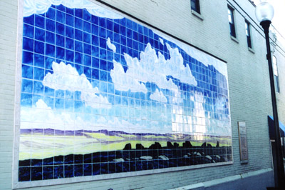
Mural in El Dorado, Kansas. In a very narrow alley just north of the
Coutts art museum on Main Street.
(photo by John D. Thiesen)
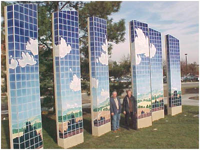
And then the Blue Sky project came up, and that was a monumental project. It was an eye-opener for all kinds of things.
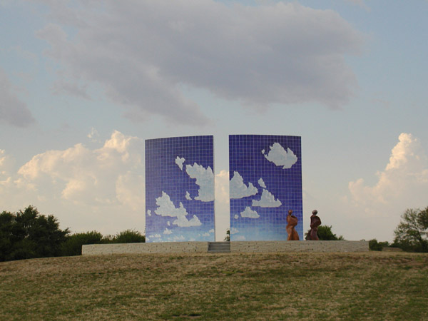
Blue Sky Project, near Centennial Park, Newton, Kansas; front (south) side
(Ceramic tiles by Terry Corbett; ceramic figures by Conrad Snider)
(photo by John D. Thiesen)
AR: How did you have the courage to propose Blue Sky Project to the municipality?
PE: That's one of the lessons: have a lot of coffee. I think the artist has to be the aggressor, because art isn't something that people necessarily prioritize. So I have a somewhat aggressive attitude, and the galleries I've dealt with have required an aggressive attitude. Survival: You can't be passive in art and survive. Subtlety doesn't cut it as far as art is concerned.
My approach is that I develop a model, and show a potential audience what I want to do, and if it doesn't happen, I still have this wonderful idea that I developed. And it doesn't really matter whether they accept it or they don't; we went through the process of the model and anr idea, and we're making art the way we hoped to make it. And so I got on that kick: we made the model. We proposed it to a committee, and there were some helpful people who wanted to see it come about. Blue Sky project was initially tied to the baseball diamond on First Street. That was an interesting phenomena: the sports complex was eventually cut, but the art project was pretty much committed, so the foundation had changed. That's when we got the place over there (the current site on Kansas Avenue by Centennial Park). That was a long process.
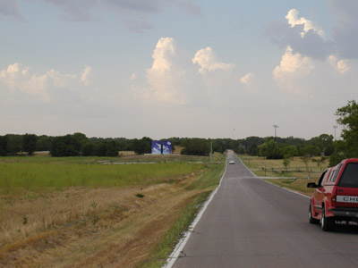
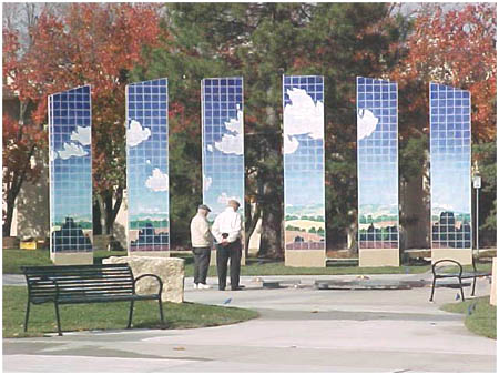
Blue Sky Project, near Centennial Park, Newton, Kansas;
viewed from a distance
(photo by John D. Thiesen)
JT: Are you satisfied with location where Blue Sky Project now is?
PE: Yes, I like the location.
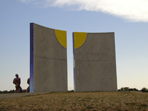
Blue Sky Project, near Centennial Park, Newton,
Kansas; back (north) side
(photo by John D. Thiesen)
JT: In some ways, my feeling was that the Athletic Park location [on First Street] was more central and more visible. Aesthetically, the new location may be better because it is more open.
PE: I like this location. Aesthetically, it is a better location. Also, the ideal was to have this thing sky against sky, and that happens here. But some people thought it ought to be more central, or on the highway where people would see it more frequently.
AR: Once the Blue Sky Project began to be tied into the signage in the community, perhaps there is potential to cause a recentering of the community. This site would become a kind of center.
PE: That's kind of what we were thinking. Some little things, that happened not because of this, nevertheless have contributed: the recent building projects including the Walgreens store, the Quick Trip, and development this direction including some of those town houses [on Twelfth Street], have increased the urban density neary the project.
Another reason, the [current] location [is important]: . .Well, back up. . .in the whole process [of the discussion of Blue Sky project], some contact with the Sand Creek restoration project by the corps of engineers developed. There was an archeologist who came down from Arizona, and I got to know him, and he would take me around. He was intrigued by the [current] location; he said there were four distinct civilizations that lived in the area. Native Americans, 500 years ago: it was a real hub. Then it was the initial land fill 100 years ago [for Newton]. The third stage was the landfill 30 years ago, covered, and then, fourth, the current culture and use.
Then he was really intrigued with how this is the perfect spot to show what happens with rivers. First, trade and commerce and so on, and then it turned into this waste area-dumping ground, then the recreational area reclaims the waste area.
JT: The site could become an archeological park, with an excavation.
PE: That's another thing we talked about: some sort of excavation with a space to walk through with both sides lined with plexiglass to see the layers; rubbish, etc.
JT: That would be another kind of thing for the people who are against most projects to react to. How do you respond to that political aspect of public art? I'm asking both about the political aspect of public art in general, in almost any situation, but certainly it's prominent here in Newton because there's an anti-faction in this community.
PE: The anti-faction is raising objections to almost everything. I suppose there are people not in the anti-faction who would be against public art because they would see it as a low priority. I'm on the side of public art, plain and simple. I think it's important. I think that a lot of people can get some use out of it. A lot of it [its value] isn't immediate. Down the road, people will see it as pretty neat.
JT: Do you think that Harvey County has a deficit of public art, or are we typical?
PE: We probably are typical, but the sculpture that we did kicked it up quite a ways because of the scale.
JT: How did the use of your characteristic clouds become part of the city signage logo?
PE: Very simply. They were working on that in the city manager's office, and they were going to make some signs. I said, I'll make a painting for you if you want, so I went home that afternoon and made a little painting, and brought it in the next day or two days later. She asked what size they were going to be. There are many signs now. I really like them. I didn't get anything out of it, but I thought it would be more detrimental in the long run to have poor signage.
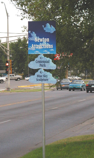
Newton city directional sign based on Phil Epp design;
this one is north of 12th and Main.
(photo by John D. Thiesen)
JT: The Blue Sky Project is a bit different from the other projects because it involved the city. How did the other projects evolve?
PE: The little mural above the Scrapbook Gallery was commissioned by the owner. Terry Corbett was interested in it, even though it was a small project and can't be seen from directly below, and is a little more literal in interpretation. There's a train motif because of the history of the Santa Fe Chief train line, which was also the name of the theater that once occupied that very building. It used to be called the Chief Theater, and the history was important. Dick McCall owns the building, and he was one of the most influential people behind Blue Sky.
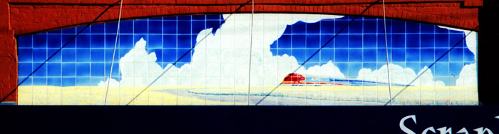
Mural above Scrapbook Gallery, 504 N. Main, Newton, Kansas
(photo by John D. Thiesen)
JT: He's not someone who speaks up in the public forums.
PE: No, he keeps a low profile, but he's very persistent, with a strong interest in Newton, and doing whatever he can to help this place. He was hands-down the biggest influence besides Lloyd Smith, who provided the funds for it.
Another project now developing is the City of Olathe project ("Reflective Spaces", R. R. Osborne Plaza Sculpture): it's a public art project that is exciting in a lot of ways. It's another sculpture. [Gesturing] this is the initial model we presented. It was interesting how it came about. The agent wanted us to do basically two slabs in mural form. I didn't want to make a flat surface, in a three-dimensional park, like a billboard with pictures on it. Sitting in a meeting, I had an idea to separate these things in this way. It will be more of a landscape, an Olathe landscape . . . The thing that makes it interesting to me is that the pieces bisect the landscape at angles; they aren't going to be flat. Light will hit them different ways at different times, with stones and sky and stuff in between the images. With the base it will be 17-18 feet tall.
Reflective Spaces; R. R. Osborne Plaza Sculpture, Olathe, Kansas;
Phil Epp and Terry Corbett
(photo provided by Phil Epp)
Reflective Spaces; R. R. Osborne Plaza Sculpture, Olathe, Kansas
(photo provided by Phil Epp)
JT: Without the focus on the sky, it looks very different.
PE: This was a compromise. They wanted landscape, so we had to do landscape. The twist comes in, in my opinion, here: the idyllic landscape, which is the way the land looks like west of Olathe, but now, with all the urban development, the landscape has a fragmented look. To me, this works as an art piece because the fragmentation is honest.
AR: The fragments are true to the landscape as it has been developed.
PE: The form of fragmentation is symbolic in a lot of ways.
JT: The obvious thing I would say about it, as a non-artist, is that you don't generally make a habit of drawing trees.
PE: Right. But notice these are interesting trees - they look like dark green clouds. [Laughs.] The same shape as my clouds.
[All of us now moved to another table in the studio to examine a model.]
AR: This must be the model for another new project you are now developing, at the Newton Medical Center, in the rotunda of the new Medical Office Plaza.
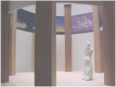
Model of Medical Office Plaza project, Newton, Kansas
(photo provided by Phil Epp)
PE: This was the space, and I made a lot of quick decisions on how to deal with it. The first idea was to make one landscape that would go all the way around, but I didn't like that idea much. So I ended up with a variety of landscapes, all different, but at different times of day or in different seasons. There is a little bit of a method to it: the images are of things you would associate with northern or southern or southwest views, sundown, sunrise, but I'm not trying to necessarily make it a decorative interior design piece that fits nicely on the wall. There are eight different paintings, and there will be a little border.
JT: Entrance?
PE: Rotunda area.
JT: Is this space behind up against the wall?
PE: It will come away from the wall, leaving about 3-4 inches of space. It's not freestanding, there is building around here. Open, 3-4 are doors. Basically open space, another floor above, plus a skylight above. This is the scale: 6 foot person.
I think it will be nice. I think it will be pretty neat. Mark Andres is working on the structure, using masonite structures for the paintings.. Round space creates problems: you can't stretch canvas on concave surface. I think we're either going to use adhesive to attach the canvas, or we may not use canvas at all.
AR: Who is funding this stunning, large-scale project?
PE: It's done through the health care foundation. Finances haven't been finalized yet.
What do you think about the idea of having different paintings? Does your eye want to see the same motif all the way around?
JT: The fact that it is broken up into segments by its structure [since the hospital space not a continuous space] makes it logical that there would be different images. If the hospital rotunda itself were one unbroken surface, it might make sense to blend around.
PE: Then I think whether I want the design to take over my work. However, this is where I'm at right now. Some pieces I really like right now include the night sky. I want some variation. A dramatic landscape next to a more subtle one. I want to break it up.
JT: There are two other directions of questions I might note: One would be to ask about artists who aren't well known but who might well be good artists; for example, Vernon Friesen is an artist in Henderson, Nebraska, and is not widely known in galleries, yet does interesting bronzes, somewhat in the Frederic Remington tradition. One direction of questions would be whether we can name and identify Mennonite artists, and what is the difference between those who are well known and less known. We might think of others whom we should interview in the future in Mennonite Life. The other set of questions occurs to me as we try to put this article together for Mennonite Life: Do you have any reflections as we put the two categories together, "artist," and "Mennonite," do they have any significance, or are they purely coincidental?
PE: Vernon Friesen was a friend of mine growing up. He was a year younger than me. I can't think of too many other Mennonite artists in the region: Robert Regier, Arlie Regier, Paul Friesen, Conrad Snider.
That's a great question. I have seen several publications describing a body of Mennonite art. My work as well as some of the other work I've seen in them seemed pretty weak to me. It's either pretty academic, or it's just flat. Lacking in energy. It's either academic, coming right out of school and doesn't usually go beyond that, or it's based in the past. That's not true of all; I've also seen amazing stuff. Again, part of it is. . . well, you go back to how the visual arts have just not been promoted very much. I don't want to blame the religious aspect, but it goes back to the graven image problem, I suppose . . .
AR: Perhaps it's time for a renaissance now.
PE: Perhaps, in that area. I think Mennonites have a tendency to do things in a practical fashion rather than pushing the envelope (in terms of scale and aggressiveness). The primary push is toward human services. . . . Mennonites and art. We had difficulty coming up with a list of names: we only came up with a few.
AR: Do you currently have a congregational home?
PE: Yes, First Mennonite, but we are not very active.
JT: Is it an art friendly congregation?
PE: I'm not too interested in hanging out with art-friendly Mennonites. This is why I like the regionalists. I don't expect to go to church and talk about art. I'm not even a fan of people performing in church. I don't even necessarily think it's appropriate for people to perform in church. I like the people, and I like the church, and I have a lot of respect for them, and I'm not sure why we don't go. We'll probably go back again sometime soon.
JT: Does the phrase "Mennonite artist" or "Mennonite art" make any sense?
PE: It would be like the phrase "Native American art." It's more nostalgic, than it is anything else.1 What is Mennonite, anyway? We go to strip malls and shopping malls and everything like everyone else anyway. I don't know. Would the art be a place to find a Mennonite identity?
AR: I very much appreciate the idea that it's problematic to claim exactly what a Mennonite is. Literary writers /novelists currently keep complicating what identity is.
JT: It's interesting that you mention the phrase "Native American art" when thinking of Mennonite art, to compare, because there you can see a stereotype of nostalgic or cheaply popularized form of art, but on the other hand, you would find artists who are Native American and would say that aspect of their identity is something they bring to their artwork in some way. There's a variety of ways you can think about binding the adjective to art and artists.
PE: I can't think of many Mennonite artists.
JT: Another name that's been brought up in the area is Nathan Hart. He has been influenced by both Cheyenne and Mennonite backgrounds.
PE: This is what I find at school. Everything is related to ethnicity. And the fact that his art would be intriguing because it would have to do with both Mennonite and Cheyenne backgrounds. But is his art any good? I'm just skeptical. When periodicals feature artists because a figure is African American, the artist is significant because of being African American. That's fine, but I would like to see the art come first. The other aspect is incidental, the political correctness of the background. What do you think?
AR: I'm interested in hybrid definitions of identity that stretch beyond historical definitions, if I'm to figure out how to live and work at a Mennonite institution. I'm interested in the problems that surround the question, because I find myself uncomfortable with narrow definitions of `Mennonites' while working at a Mennonite institution. I also think that ethnicity is one viable category with which to track historical angles and influences, but I agree that it can have unfortunate nostalgic effects.
JT: What I would say is that identity isn't a property but rather a process by which a person identifies, but also, what others identify that person with, so it's interesting to look into or under the various ways people identify being part of a certain category. So when odd or unusual combinations occur, then I'm curious if there's any significance to those combinations of categories in how these people identify themselves or are identified, categorized by others.
PE: We keep bringing it back to the social link, but I think art making is a little bit removed from the social aspect. I don't want to emphasize social service images in my art.
JT: Another way of asking a parallel question would be something along the lines of replacing the ethnic adjective with a geographical adjective. Are you a Plains artist or a Southwestern artist? Are you a Nebraska or Kansas artist?
PE:That's more important. That's a good point.
[Gesturing]: Painting-wise, this is a painting with substance, and some sense of human reaction, but no pin-pointable references to native American or Mennonite elements.
AR: You're saying these paintings are not so much about cultural ideas.
PE: Human presences, but not specific ones. More rural ones, if anything. I'm a rural artist.
JT: [Gesturing to a painting]: Thinking of geography, realism and so on, this painting jumps out at as more Eastern New Mexico. Not Nebraska or central Kansas.
PE: I grew up overlooking a big basin, a low land area where water would collect. We had a quarter section pasture. Prairie, actually: it was different from a pasture. No buildings for a few miles. Pretty open space; I always liked the plains. I can see that this painting does look a bit more like eastern New Mexico; most of the time I don't really identify them as belonging to a certain place. They develop as their own location. Usually they have a little mix of New Mexico and Kansas in them.
Epp home in Henderson today
(photo provided by Phil Epp)
Epp home in Henderson today
(photo provided by Phil Epp)
[Gesturing to another painting]: This one is about back side of a sign, a billboard, a perfect structure, set against a landscape. At first it was against a vibrant skyscape, but they were conflicting so I deadened back the sky. This one is interesting because it kind of makes the viewer ask what is on the other side, what it is advertising, but it doesn't offer any clues. It is interesting visually.
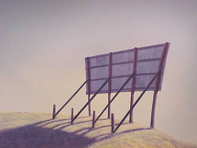
Billboard, 30x40
(photo provided by Phil Epp)
AR: There is something ironic and funny about painting the back of a billboard.
You're looking at another kind of space, not organized by regional geography. The billboard is set by a cliff, like a billboard at the end of the world, but even then you can't see what's on it.
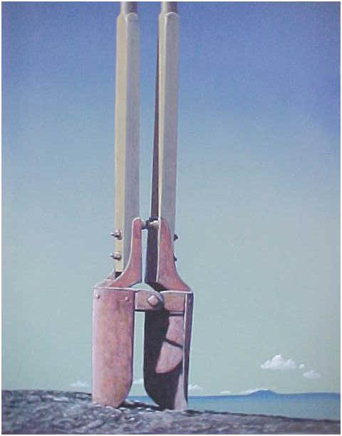
Post Hole Digger
(photo provided by Phil Epp)
PE: I don't mean anything negative. Does it do what I want it to do? I began a close-up of a post-hole digger. It's almost a pop art image, or something like one. I did another painting of an old car with a lighted Christmas star on top, from Burns, Kansas. I like those kinds of images that have the capacity to be symbolic.
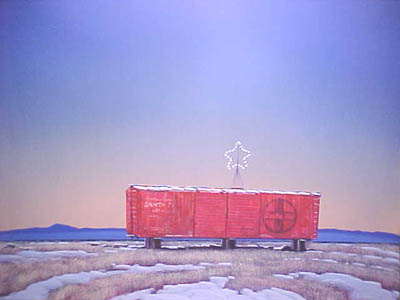
Box Car, 24x30
(photo provided by Phil Epp)
AR: Christmas stars and old cars: On the one hand, I sense in your work a little bit of the sacred landscape, but on the hand also a little bit of surrealism, a little bit of pop art. The Blue Sky sculpture seems to share the ethos of Rene Magritte's famous This is Not a Pipe, by putting an image of a sky up against a sky.
PE: Yes, there's a certain sense of humor.
JT: It is a surrealist image to cut a hole in foliage to see the sky.
PE: Magritte did some of that too. Also, everything that I've done has been in some way or other before. Wayne Thiebaud is a California artist that is still living, that had images of pies in a glass pie case. He currently has a show at the Kemper Museum [in Kansas City, MO].
I like looking at billboard signs. The structure of it is what I find interesting: the front side is all smooth and shiny, and now they're even covered with vinyl that wraps around and ties up, so they don't even paint them any more. But the back side has all kinds of different structures. Next time you go to a major highway, just look at the back sides. Brace supports. They are almost always tacky, as if they didn't measure them. Some of them have a real elaborate structure; what keeps them up in that wind is amazing. Sometimes you just do things for fun. This one I did for fun.
JT: Another angle of question we started on before a bit when we talked about less known artists such as Vernon Friesen, and also when you said before about art with ethnic labels on it that you want to ask, is it good art?
PE: You want to ask me, "What is good art?"
JT: No, it's more political than that. What sort of status hierarchy in the art world is your involvement? If I go to Taos, and walk around in galleries, and I see a Phil Epp painting, I think that is supposed to impress me, and I think he must be a really important artist. But as a non-artist I don't really know whether I'm seeing important art. Two things are going on here: What's good art, and what's the status hierarchy, among people who are knowledgeable about art, who buy and sell art?
PE: That's a good question, but I'm not sure how to answer it. There are several status tiers. First there are really significant artists with well-known names. Then there would be another group of artists with New York connections. So there are several levels of art. Status? Is that your question?
JT: Yes, does status have to do with how good the art is; how does that relate to how people relate to the art world and art market?
PE: You could say that there are five tiers of significant art, based on visual impact or even price. Or you could say there are two or three. I think there are regional groups.
JT: There is a hierarchy at the national level, and then another one in the category of Southwestern artists if that's how people label you.
PE: There would even be a hierarchy of Kansas artists.
JT: I doubt if people come in from the outside and say that they want a Kansas painting, — or maybe they do—I don't know. They might come in and say they want Southwest art.
PE: Even Kansas art has a long history. People just go nuts over Birger Sandzen paintings now. There are paintings by him that are worth a quarter of a million dollars now. Let's talk about Kansas art.
[All of us now moved to the library adjacent to the studio. In February-May 2000, the Kauffman Museum in North Newton, Kansas, had an exhibit titled "Drawn from the Plains: American Regionalist Art, 1925-1950" which featured prints, drawings, and paintings from the Phil and Karen Epp collection, some of which were on display in the library.]
Here is a Kansas magazine from the 1930s. Art was pretty significant in the 1930s here through the community murals by the WPA and that sort of thing. This is an early record of some of the early Kansas artists (from the turn of the century and on.)
[Looking at books:] Here's another significant book on the effect of the realists on the state—Thomas Hart Benton, John Stuart Curry. The "prairie printmakers" were Wichita-based and also joined with artists throughout the country. Kansas was a pivotal place in the country for people making prints in the 1930s. People from Taos would come up and have artwork printed here. A number of publications have come out of KU on Grant Wood, Sandzen, Curry, Benton.
Here's another interesting publication: Remembering the Family Farm. I'm in it but I'm one of the few artists who aren't dead.
AR: What are the particular lines of Kansas art that have influenced you?
PE: All the realists influenced me,2 among other influences: Benton, Curry. And there was some overlap: Ward Lockwood was a New Mexico artist who was born in Kansas. He was a significant New Mexico artist. He came to Kansas, started abstraction, from a pretty realistic starting point. He has Kansas roots. Quite a few of the New Mexico artists have Kansas roots. Part of that has to do with the Santa Fe railroad and just the intrigue with the Southwest. But there's quite a connection between the Southwest and Kansas art. Many of these were swallowed up by modernism. Others adapted and updated their realism to modernism.
AR: I recognize Teter Rock [looking at a painting by Phil Epp leaning against a wall].
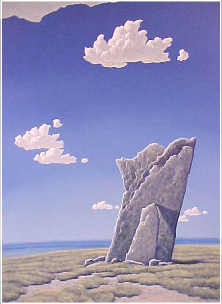
Teter Rock, 40x30 acrylic on board
(photo provided by Phil Epp)
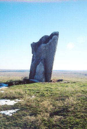
Teter Rock, north face, Dec. 2003,
Greenwood County, Kansas
(photo by John D. Thiesen)
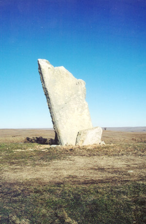
Teter Rock, south face, Dec. 2003
(photo by John D. Thiesen)
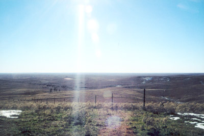
View southwest from Teter Rock, Dec. 2003
(photo by John D. Thiesen)
PE: I have to tell you a story about Teter Rock. Two-three weeks ago, a Chicago dealer came through, who handles some of my work, but who handles mostly older stuff, regionalist, too. An urbanite, intrigued about the Midwest, partly because of the art he deals in. I thought I'd take him to Teter Rock, 20 miles east of Cassoday.
It was a Sunday afternoon, one of those hundred-degree days. We walked around. Then we went back to the car, but it wouldn't start. We hadn't seen a human being all afternoon, and were 20-30 miles from Cassoday. We hadn't seen another car since we left Cassoday.
We didn't have cell phones or anything, but the reality hadn't hit me that we really might be stuck out here. I finally realized I was using my wife's car key to the other car. Finally we made it back, but I don't think he'll speak to me again. You don't think about some place being remote until you're stranded.
I'll show you some of these others [Kansas artists]. This is Curry, the one who has the statehouse murals. Here's someone else I really like, William Dickerson. I think he'll be getting some press in the next few years; the agent from Chicago was interested in his work. He was a real genuine kind of realist; he really was interested in Kansas. His prints are just wonderful.
This is Dale Nichols - not a Kansas artists particularly. Most of these people work with this prairie group of artists. That was an influential piece: "Cloud," by John Roger Cox. I did some research on him in an art history class at WSU. Interesting individual, with quite a bit of turmoil in his life: he ended up being an alcoholic. Dealers are more and more interested in rural imagery. I think that, like Southwest Art, Kansas is gaining a lot of interest, partly because of its history in art.
This painting here is another one of those original prairie printmakers, but this one is a little more modernist. Modernism pretty much shut most of them down. They were working in a regionalist mode, and then abstraction ruled from 1950 to the present, practically.
It's just now that they are going back and digging out this stuff that got stuffed away during that time. This little painting I just got recently is by Lester Raymer, another important Kansas artist. Have you been to the Red Barn Studio in Lindsborg? You've got to go. In many ways he was a lot better as a painter than Sandzen. He did a lot of religious subject matter too, so he'd be an interesting one to study. He died in 1991.
AR: This is quite a collection of Kansas art you've got here.
PE: Yes, it keeps growing and changing a little bit.
AR: How does your process work? How much time do you spend out in the landscape? Do you take photos?
PE: I take a lot of photos. I don't usually paint on location. I draw on location some times. Then I come back and concoct it, based on what I know, what I like to see, and what's expected of the picture, or what's going on at the time.
AR: How would you describe how the landscape works for you compositionally? How did the low horizon line and gradations of colors in the sky evolve?
PE: Those aspects evolved and became refined over the years. Depth is created by darker color at top of the composition. When teaching art, one is always teaching perspective. That affected my work. The low horizon gets you kind of looking up. Low horizon is something that, talking about Kansas and Midwestern painters, influenced me in the 1970s. I remember Keith Jacobshagen, who I met once or twice. He was an instructor at Nebraska, and was one of the first artists that I remember shoving the horizon line way down. I remember going to one of his shows at Ruben Saunders Gallery in Wichita and thinking wow, that's pretty neat. And so, I think that's where I started shoving the landscape down. He was a part of a school of landscape painters at the time, and he did that. It worked for me to shove the horizon line down quite a ways because it became more about sky than about land.
JT: Would a person who is not from the plains say that it intimidates the viewer?
PE: You mean the sky [intimidates the viewer]?
JT: Because the viewer has to look up at the monolith (Blue Sky Project) or the sky?
PE: I don't know. It might not seem natural for some viewers. It might seem long to some viewers. Compositions are more usually divided into thirds.
AR: How is retirement?
PE: It gives me time to get stuff done, but I'm not really retired. I have to make this art work. I'm not in a position to sit back and not be productive.
JT: How did you make the decision to retire?
PE: Early retirement was the obvious option, so I could continue to earn a portion of my salary, which was wonderful. I wasn't burned out: I was tired of the same activities. Later on I felt I was on a treadmill. Now it's kind of like I just graduated from college.
1. In a later conversation with Phil Epp, he noted that scholarly articles about his work sometimes participate in the problem he names here by framing his identity and work in a nostalgic sense. See the treatment of Mennonite identity and history in "Phil Epp" by Franz Brown, Southwest Art (June 1997): 90-95. For a less problematic treatment, he recommends a later article by the same writer: "Cloudscapes and Open Spaces: The Art of Phil Epp," Taos Magazine (August 1999): 16-18.
2. Phil Epp noted that he researched Kansas art history and became more influenced by the realists later in his career, and thus identifies them in this interview as influences in the last few years of his work. His earlier influences include a wide range of artists, including the minimalists and color field artists who developed as dimensions of abstract expressionism. For example, the color fields of Mark Rothko paintings offer a precedent for the abstract quality of landscape and giant color field of the sky in Phil Epp's paintings. Phil cited two contemporary artists who have been important influences: Richard Serra (minimalist American sculptor) and James Turrell (minimalist, American, Quaker installation artist). Turrell's work shares a focus in what he describes as "skyscapes" with Phil Epp's compositions; his work on the geography and sky space of Roden Crater can be viewed online. In addition, Robert Regier continues to be an influential colleague.