 December 2000
vol. 55 no. 4
Back to Table of Contents
December 2000
vol. 55 no. 4
Back to Table of Contents
Transitions
Bob Regier
From September 16 to November 5, 2000, the Salina Art Center featured selected works by Bob Regier, major artist, Mennonite, and longtime Kansan, covering the years 1965 to 2000 in a show called "Transitions." (You can find a virtual tour of the show at http://www.salinaartcenter.org/bob/gallery.htm.) As Saralyn Reece Hardy, Director of Museums and Visual Arts for the National Endowment for the Arts, noted in her introduction, "These transitions invite us to see the familiar as the beginning of personal revelation and encourage us to embrace new ways of seeing, thinking, and expressing."
As part of this arts issue, we offer an excerpt from Saralyn Reece Hardy's introduction to the show, "Dawning Sight." We also include here a retrospective by Novelene Ross, chief curator, Wichita Art Museum, "A Vision in Progress," as well as Bob Regier's artist's statement and select transitional pieces from the show.
Dawning Sight
Where and how do we discover those rare moments of awareness that illuminate the horizons of our understanding? Bob Regier's art continues to awaken my eagerness to live with open eyes. His images rise and dissolve, focus and merge, creating generous poems of light and revelation. They voice questions of belief, grace, and beauty.
Bob's uncommon clarity and subtlety of expression as artist, designer, and teacher have influenced the lives of many. His touch informs projects across Kansas and beyond, and his work is found in churches, museums, public buildings, corporate collections, and homes. We long for Bob's sense of wholeness; wish for his quiet layering of color, shape, and content; seek his hand on our most important projects; welcome his discipline and intuitive spirit woven into our creative processes. Sculptor Louise Bourgeois comments, "Beauty is learning, understanding, solving problems, and a reward of effort: it is to transform chaos into harmony." It is this relationship to the tangible world and the desire to recognize its incandescence that distinguish the art, practice, and life of Bob Regier.
Saralyn Reece Hardy
 |  |
A Vision in Progress
Robert Regier once declared that he created his strongest works "at transition points . . . when work is evolving . . . when contradictions are not yet fully resolved." The solo exhibition mounted by the Salina Art Center under the title Transitions, which surveys approximately thirty years of fine arts print production, attests to Regier's passionate dedication to an inner voyage of discovery. The technical landmarks of this journey include experimental intaglio, color woodcut, and monotype. Nature, particularly the primal landscape of the Kansas prairie, has anchored and continues to anchor the artist's search for universal signs of spirit. Throughout the process of Regier's art-making, the polar qualities of hard edge and diffuse color, disciplined rhythms and transparent layering, finesse and accident, reoccur in ever-shifting alignments.
 color intaglio, 8" x 8 1/2" |
 |
From 1957 to 1963, Regier served his "apprenticeship" in the visual arts as art director for the General Conference Mennonite Church, Newton, Kansas. This experience as graphic designer and illustrator satisfied that methodical aspect of his temperament forged by his youth in rural Minnesota growing up with the examples of sacrifice, perseverance, and craftsmanship evidenced in the lives and faith of his parents. Yet the practical restraints of Regier's work also rendered him restless for greater creative challenge.
 |
 wood relief print, 21" x 29" |
In 1960 Regier took a summer class in printmaking at Wichita State University from David Bernard, a student of Mauricio Lasansky who had spawned a national renaissance of creative printmaking from the University of Iowa. Stimulated by this plunge into artistic risk-taking, Regier earned an MFA degree (1965) at the University of Illinois where he studied with Lee Chesney, also a Lasansky student, and where he worked with visiting artist Gabor Peterdi. The latter energized Regier by his reference to the innovative thinking of Stanley William Hayter, father of the experimental spirit in 20th-century printmaking. This training thrust Regier into conceptual currents that closely paralleled the aesthetic of abstract expressionist painting, directions expanded by his 1970s workshop experiences with painters Jack Tworkov and Milton Resnick. As Regier readily understood, the subjective impulses of a process-oriented aesthetic posed fundamental challenges to the dictates of his designer's T-square and compass.
 |
 monotype, 10" x 10" |
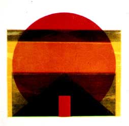
The color intaglio print titled Seven O'clock Orange, 1974, illuminates the artist's translation of his pedagogical sources into a vocabulary more precisely his own. Following the example of Hayter and Lasansky, Regier continued to work extensively in intaglio, pursuing imagistic discoveries through the exercise of mixed and novel variations upon old intaglio techniques. Juxtaposing areas of aquatint, lift ground, and relief-rolled color applied to two separate plates, the artist conjured up an ominous darkling plain lit by a jagged blood-red horizon, an image whose emotional intensity echoed the brooding complexity of mid-century intaglio production. Yet Regier had also established what would become his characteristic preoccupation with the nuancing of colorfields through mainpulations of tones, intervals, and edges.
 monotype, 26" x 20" |
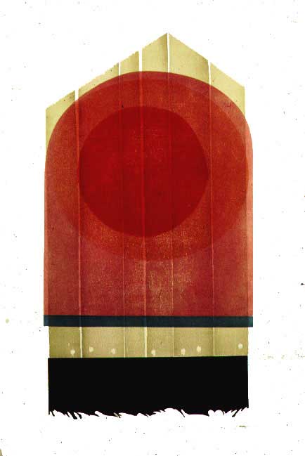
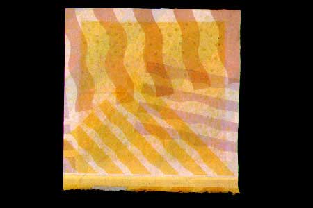
In the 1970s Regier gradually withdrew from the virtuosity of intaglio to adopt an ascetic mode of woodcut. Responding to the inspiration granted by chance, the artist picked up fragments of discarded wood fencing that he used to make a series of hieratic images appropriately named Prairie Icon. He combined the humble textures and shapes of this found object with an equally simple linoleum block form to create a primitive sign charged with intimations of gravestone and sunrise.
 monotype, 20" x 26" |
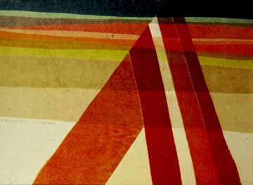
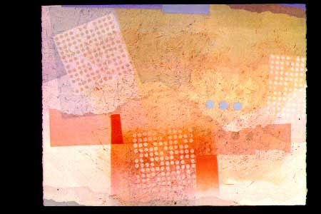
Landscape motifs pervaded the woodcut images of the 1970s. Conventional planar divisions of flat terrain, irregular horizon line, and layered sky together with common symbols like the orb of the sun and ribbon-like highways arcing over hills appeared in numerous images of the period such as Flint Hills Journey, 1974, To the Plains People, 1977, and Along Route 177, 1978. As this sequence indicates, the artist turned his vision ever more inward, reducing naturalistic detail to abstract shapes defined by invented colors and crisp edges.
monotype, 11.25" x 40" |
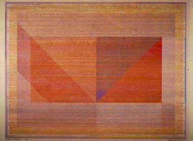
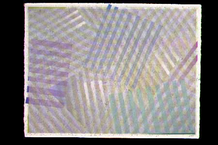
Throughout the decade of the 1980s Regier intensified his investigations into color and the woodcut medium. Orange Ambiance, 1983, illustrates the artist's evolving attitude toward the dynamic interplay of color and line and toward his own sense of himself as maker. Exchanging decorative elegance for a concentration upon optical effects, Regier immersed himself in a process that merged controlling activities with submission to improvisation. Starting his work on Orange Ambiance with no preconceived vision of the final image, the artist cut hundreds of parallel lines into a rectangle of birch plywood. He cleaned and re-inked this single plate to lay down multiple applications of color one atop another. As the layering progressed, Regier taped off selected sections of the plate to create varied shapes, color combinations, and movements of color intensities across the surface. The completed image radiates extraordinary subtlety. Balancing qualities of vibrant luminosity and rhythmic precision, a congress of overlaid geometric bodies appears to float in a surrounding atmosphere of softly luminous vapor.
 monotype, 20" x 26" |
It is astonishing how often we see lessons learned early in life that have been stored away come forth at a later date to help shape our maturity. Regier experienced this phenomenon in regard to the relationship of his painting to his printmaking. As a graduate student he made paintings as often as he made prints. Painting in the abstract expressionist mode, Regier introduced himself to the ideas of layering color, gestural marking, and improvisational facture that have emerged three decades later as central forces in his printmaking.
 monotype, 20" x 26" |
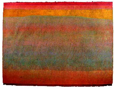
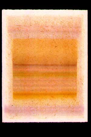
Regier's monotypes of the late 1990s bespeak an increasing commitment to the translucency of color and its capacity to evoke the emotive realities of time and space. Working on an acrylic plate in successive states of marking and wiping, using tools as unexpected as folded rags and Brillo pads, he laid down veils of color so ethereal they seem to be the manifestations of breath. Occasionally, hard-edged opaque lines of color appear at the margins of the images, evoking memories of the data lines at the edge of a press sheet and bringing the viewer back from the depths of inner reverie to the hard surface of the present moment. Robert Regier has produced a distinguished body of work. However, as Transitions so handsomely demonstrates, the artist is yet fresh into his aesthetic journey.
Novelene Ross
Artist's statement
I'm mindful that my images are nourished by community and place - the plains environment. It's the landscape that has been given to me, the place that provides my bearings. But representations of that place are not the inevitable result of nourishment. Rather, nourishment provides my visual vocabulary of color, luminosity, texture, space, time, rhythm, pattern, dissonance, and harmony as the interaction of human imprints and natural form are observed.
While explicit descriptions in my work are usually absent, I'm often aware of essences or metaphor - though reluctant to say just how an image expresses either. I'm never quite sure myself! You, the viewer, can explore these connections to landscape and human history and bring your own experience to this exhibit. I would hope that the work can be engaged on several levels - pure visual language, symbolic or metaphoric content, and sometimes oblique or direct allusions to our common visual world.
Much of the work in this exhibit reflects explorations in the medium of the monotype within the past five years. But Saralyn Reece Hardy, who has given me invaluable support and guidance in the exhibit's formation, encouraged the inclusion of selected earlier works marking pivotal or transitional points in my visual journey from the past into the present. A search of the past inevitably juxtaposes elements of curiosity and fear. What kind of a visual trail have I left, and is it an authentic one that I can still own? Will revisiting a print or painting sold over twenty years ago be an embarrassment to me? Has it been relegated to someone's closet or garage sale? I was gratified to discover that those who possess these earlier works still care for them. I'm grateful for their generosity in making them available for this exhibit.
Recent prints tend to proceed without plan. The abstract-expressionist painter Jack Tworkov described this approach by commenting that " abstract work rests on automatic processes at least for its beginning. At some point in any picture, at the moment when some elements appear in it which I identify, I have to rescue the painting from the automatic process and assert my will to force the picture through to a conclusion I can accept." I always hope that each pass through the press helps clarify elements that I can identify, so that the "rescuing " process can begin. But it sometimes fails to commence. I have a drawer-full of prints-in-progress - awaiting a rescue that may never come!